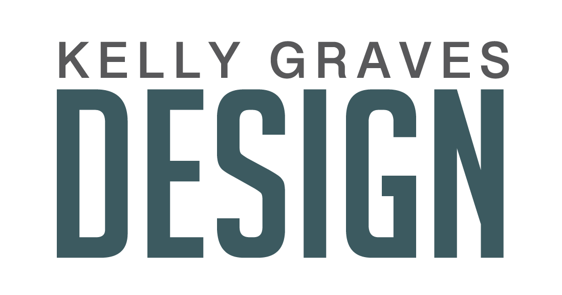
As the sole designer on this project, I worked closely with the client to establish their end goal. They wanted a logo that would stand out from the rest of the other companies in their territory. Skylines and roofline illustrations are a logo staple in the home inspection business and this client wanted something different. The only requirements were that the logo needed to be a variation of blue and they wanted multiple layouts of the mark.
Initially, the client also wanted to see some sort of skeleton integrated into the design. Now, my first thought is how can I make a logo look respectable and professional while working a skeleton into the concept? After some sketching and playing around, I was able to find a few ways to incorporate this.
After the first round of concept review, the client decided they didn’t want to have a literal skeleton anymore. Instead, I used a bone as the foundation of a house. The final design has variations ranging from the full logo with words, to the simple stand alone mark. The versatility allows for the logo to be used on a variety of platforms/projects.
Round 1 Design Concepts
Note the skeleton. When a client has a specific idea in mind, I try to make every attempt to fulfill that idea. It may work or it may not, but it’s a great way to let them see that vision come to life. Who knows, it could lead to a great final idea. This is one of the reasons I enjoy working on logos. The back and forth between myself and the client is priceless.